
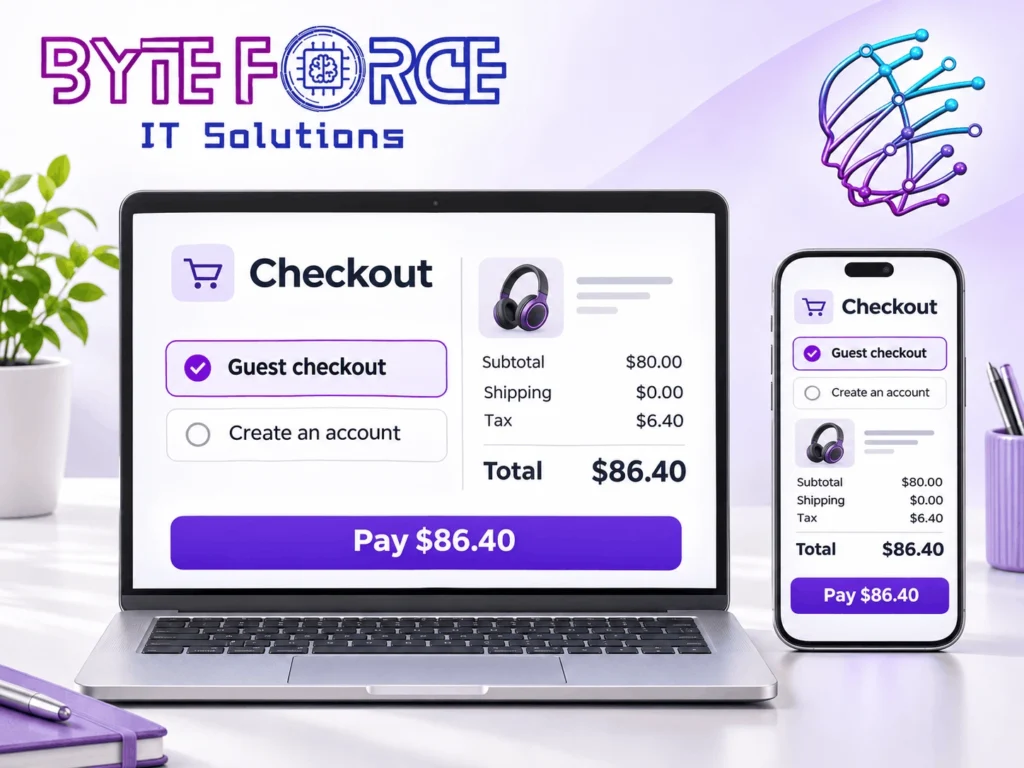
Hidden fees, forced sign-ups, long forms, slow pages, and failed payments can cost you sales at checkout. Show the full cost early. Let guests buy. Keep each step clear and test the whole flow on a phone. Then track where buyers leave so you can fix the right problem first.
Baymard Institute’s current cart research puts the average cart abandonment rate at 70.22% across 50 studies. Its page labels the reasons data as 2026 data. Among reasons beyond just browsing, 40% of surveyed US shoppers cited high extra costs, 18% cited forced account creation, and 17% cited a long or complex checkout. These shares do not add up to one whole, and the global average does not set a target for your store.
Some people add items to compare prices or save ideas. You will not win every cart. Focus on the buyers who want to pay but hit a block.
Digital marketing and SEO services can bring people to your shop. A clear checkout helps those people place an order. You need to check both parts of that path.
1. You Hide the Full Cost Until the Last Step
A buyer sees a $40 item and decides to buy. At the last step, the price jumps to $58. Shipping, tax, and a fee now change the choice.
The problem may come from the amount, the surprise, or both. A lower price on the product page means little if the buyer cannot judge the real cost.
Show buyers what they will pay
Give a shipping estimate in the cart. Ask for a postcode when you need one to work out the cost. Show tax as soon as you can, and label an estimate as an estimate.
Keep the total in view when buyers pick a new delivery option. If you offer free shipping above a set spend, state the rule near the cart total.
Do not hide fees behind a small icon. Use a short label that tells the buyer what each charge covers.
2. You Make New Buyers Create an Account
A new buyer may want one item, not a new password. A sign-up screen adds work before you have earned much trust.
Email checks and password rules can break the flow. A buyer may leave your store to find a code and never come back.
Make guest checkout easy to find
Put a clear guest option beside the sign-in choice. Do not make the guest link hard to see.
Ask for the details you need to send the order. After the sale, offer an account so the buyer can track orders or save details next time.
If your store needs an account for a real reason, explain that reason before the buyer starts. Test whether the rule serves your buyers or just your own team.
3. Your Form Asks for Too Much
Each box gives a buyer one more task. A long form can feel even longer on a small screen.
Check each field with one question: Do we need this to take payment, send the order, or meet a real rule?
Cut work from the form
Start with these checks:
- Remove fields you do not need.
- Mark extra fields as optional.
- Use clear labels above each box.
- Let browsers fill in saved details.
- Let buyers use the same address for billing and shipping.
- Explain why you need a phone number when you ask for one.
Do not assume that one page always beats several steps. A short flow with clear steps may feel easier than one long page. Test the flow your buyers use.
4. Your Mobile Checkout Looks Fine but Feels Hard
A page can fit a phone screen and still fail the buyer. Small buttons, tight text, and pop-ups can make the next step hard to reach.
A chat box may cover the pay button. A keyboard may hide an error. A buyer may need to zoom in just to read a label.
Test with your thumbs
Place an order on a real phone. Use a small screen and a normal mobile link, not just fast office Wi-Fi.
Check that buyers can tap each button with ease. Make text clear without zoom. Keep labels in view when the buyer types.
Try more than one browser. Test both a card and a wallet if your store offers them. Complete the order from the ad or search page where a new buyer would start.
5. Your Pages Stall or Jump as Buyers Pay
A slow page adds doubt at the worst time. If nothing happens after a tap, a buyer may tap twice or leave.
Speed also matters before checkout. In a Rakuten 24 case study on web.dev, last updated in August 2022, the retailer ran a month-long landing-page A/B test. The faster version led to a 33.13% rise in conversion rate and a 53.37% rise in revenue per visitor. This was a page-speed test, not a checkout-only test. Your store may see different results.
Keep the path to payment steady
Review large files, extra apps, and scripts with your web team. Remove tools that add load but serve no clear need.
Keep space for page elements so they do not push a button as someone taps it. Show a clear progress message while payment runs. Prevent repeat taps from creating more than one order.
Test speed through the full buying path. A fast home page does not prove that the payment step works well.
6. You Miss the Payment Options Your Buyers Use
A buyer may have funds and still lack a way to pay on your site. Their card, wallet, or local payment method may not appear.
Adding every payment option can bring extra fees and clutter. Pick methods based on your buyers, your market, and your payment provider.
Check demand before you add more
Look at buyer questions and payment failures. Ask support which options people request. Check which methods your provider supports in the countries you serve.
Show the true choices near the payment step. Display wallet buttons only when they work for that device and buyer.
Test each option after setup. A payment logo does not prove that the payment works.
7. Your Error Messages Give Buyers No Way Forward
“Something went wrong” tells a buyer very little. They need to know what to fix and how to try again.
An error can also wipe out the form. Now the buyer must start from scratch, even if they made one small mistake.
Help people recover from errors
Keep safe form details when a step fails. Put the message next to the field that needs a change.
Use clear prompts, such as “Enter the postcode for your billing address.” Let buyers type an address by hand if a suggested address does not match.
For a failed payment, show a safe next step. Let the buyer try another method or reach support. Do not guess at the bank’s reason for a decline.
Test the failure path as well as the happy path. Ask what the buyer sees when a bank check times out or an address lookup fails.
8. Your Delivery Promise Leaves Buyers Guessing
“Standard shipping” names a service. It does not tell a buyer when the order should reach them.
Someone who needs a gift by Friday needs a useful date. Vague timing can make even a low shipping fee feel risky.
Give a clear arrival range
Show a realistic delivery date or range for the buyer’s address. Include packing time when you work out that range.
State order cut-off times if they affect the date. Explain delays for preorders and items that need more time.
Let buyers compare the price and date of each option in one place. Make only promises your team can meet, and update the message when conditions change.
9. Your Discount Box Sends Buyers Away
A large, empty promo box can make a buyer think they have missed a deal. They may leave to hunt for a code.
That search can take them to another store. Even when they return, an expired code may add more doubt.
Keep discounts clear and fair
Use a small “Have a code?” link instead of a large blank box. Apply an offer on the buyer’s behalf when your system can do so.
Show the discount in the order total. Explain the spend rule, expiry date, or item limits in plain words.
If a code fails, tell the buyer why. Keep the cart intact and let them carry on without a code.
10. You Add Doubt Near the Pay Button
A new buyer may pause when they cannot find your contact details or return terms. Pushy pop-ups and false countdowns can make that doubt worse.
A badge alone will not answer every concern. Buyers also want to know who runs the store and what happens if an item does not suit them.
Answer the last few questions
Place a short return summary near the order review. State the return window, key limits, and who pays return shipping.
Keep a clear route to support. Use true reviews and accurate payment marks. Explain any hand-off to a payment provider before it happens.
Avoid preselected extras that raise the total. Let buyers choose add-ons with a clear price and a clear way to skip them.
11. Your Marketing Promise Changes at Checkout
An ad says “free delivery,” but the cart adds a charge. A search result shows one price, while the page shows another. These gaps can waste clicks you worked hard to earn.
Check the whole message, from the first click to the last tap. Buyers should not need to solve a puzzle to find the offer’s real terms.
Keep the offer in sync
Match prices, stock, and offer dates across ads and store pages. Show key limits before a buyer adds the item to the cart.
SEO services can help people find relevant pages. Checkout work serves a different goal: helping ready buyers finish. A checkout change alone does not prove a rise in search rank.
Want to review how you attract shoppers? Explore Byte Force IT Solutions’ SEO services for your online store’s search goals and discuss the pages you want people to find.
12. You Count Visits but Miss Where Sales Stop
A store can gain visits while orders stay flat. If you track only traffic, you may keep spending on the wrong part of the journey.
Find the step where buyers leave before you choose a fix. Then check for real errors, buyer concerns, and gaps in the data.
Track the steps that lead to an order
Google’s ecommerce measurement guide explains events such as begin_checkout, add_shipping_info, add_payment_info, and purchase. These events can help you measure the path through checkout when your setup sends them correctly.
Check the event setup with test orders. Compare your reports with actual store orders. Watch for missing purchases or repeat purchase events.
Review phone and desktop results on their own. Compare new and returning buyers, plus traffic from search, ads, and email. A drop in one group can point to a more useful test.
Want to review how your campaigns lead people to your store? Discuss digital marketing services for your store’s traffic goals with Byte Force IT Solutions.
Which Checkout Fix Should You Try First?
Fix faults that stop payment before you test small design changes. Then work on the issues that affect the most ready buyers.
Use this order as a starting point:
- Repair broken buttons, failed payment paths, and cart errors.
- Show costs and delivery terms before the final step.
- Remove needless sign-ups and form fields.
- Make the phone flow easy to use.
- Test payment choices and small layout changes.
Let your own evidence change that order. If buyers cannot pay on one browser, fix that fault even if most visits come from another browser.
Set one clear measure for each test
For a test of the checkout flow, track completed orders as a share of checkout starts. Use the same counting method for both versions.
For example, 80 orders from 200 checkout starts gives a 40% completion rate. If a later test gives 90 orders from 200 starts, the rate reaches 45%. Those sample figures show the maths, not a promised result.
Do not claim a win from a few orders. Give the test enough time and traffic to make a fair comparison. Account for sales, stock gaps, and shifts in traffic. Check profit and refunds as well as orders.
Why Choose Byte Force IT Solutions
Byte Force IT Solutions provides digital marketing and SEO services. These services relate to how people find your business and reach the pages you want them to visit.
If your store needs help with those goals, start with a clear brief. Share your main products, the pages you want to promote, and the point where your sales journey needs attention. Ask the team to confirm the scope and measures before you agree on work.
To discuss your needs, talk about SEO and digital marketing for your store or call +971 50 250 7941. Use that first talk to agree on the service fit and next steps.
Conclusion
Make checkout clear, quick, and easy to trust. Show costs early, cut needless tasks, and test payment on real devices. Use your own sales data to choose the next fix and check whether it helps more buyers finish.